While bold maximalism and colour drenching have made a comeback in recent years, modern minimalism—rooted in quiet luxury and biophilic tranquillity—continues to lead the way in commercial interior design. Its timeless appeal proves it’s far more than a safe or “boring” choice; it offers a versatile foundation where form meets function.
As our lives become increasingly digital and fast-paced, the shift toward minimalist design reflects a more profound need for spaces that support our well-being. By moving away from visual “noise” and unnecessary clutter—whether in the workplace, at home, or shared environments—minimalist interiors create room to breathe and help quiet a busy mind. Grounded in the “less is more” philosophy, this approach is especially well suited to commercial spaces, where clarity and calm can boost both productivity and wellness.
Defined by neutral tones, clean lines, and thoughtful restraint, minimalist interior design also allows for easy updates. From new furniture and seasonal styling to brand refreshes, its flexibility means you can evolve the space over time, without starting from scratch.
In this article, we’ll explore how to elevate minimalist design by using cool tones, metallic accents, and compliant architectural features, so you can create a space built to last.
Modern Minimalist Interior Design: Balancing a Cool Palette with Metallic Accents
Using Cool Tones as a Base Palette
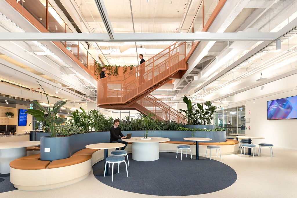
Blues, greens, greys, silvers, blacks, and whites with cool undertones offer a clean, crisp aesthetic, evoking calmness, clarity, and understated elegance. Cool tones are ideal for modern minimalist interior design as a base palette, particularly in commercial spaces such as office buildings, hotel lobbies, wellness centres, and high-end retail stores.
Among the most popular choices are chalky whites and deep charcoals, which create a contemporary yet enduring canvas for other architectural features and accent elements to shine.
However, texture can play a crucial role in preventing cool palettes from feeling flat or overly sterile. Consider matte finishes and subtle textural details, such as a statement charcoal wall with a combed or sand-swirl render to add depth and visual interest.
Similarly, decorative ceiling mouldings and feature lighting can help draw the eye upward and enhance spatial flow.
Adding a Subtle Touch of Shine with Metallic Accents
When set against a subdued, cool-toned backdrop, adding metallic accents can bring your design a touch of understated luxury and contemporary elegance.
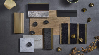
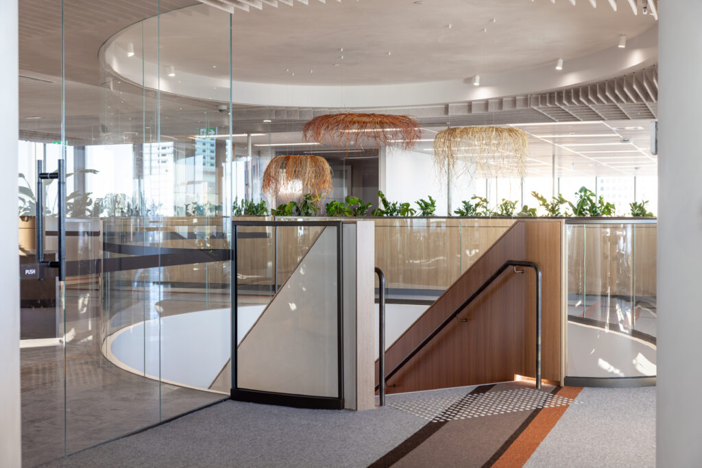
Brushed nickel, pewter, blackened steel, and soft brass tones can work well, particularly when used as architectural elements such as tactile indicators, stair railings, and lighting fixtures. From stain to high-lustre finishes, the level of shine you choose should also consider how the space is lit, as metallic surfaces naturally reflect and amplify light.
Staying true to minimalist interior design principles, it’s important to introduce metallic accents sparingly and purposefully to avoid overwhelming the space or leaning too far into an industrial aesthetic.
For a balanced contrast, consider pairing metallic elements with natural textures and neutral tones—for example, our solid brass tactile indicators alongside walnut timber flooring.
Creating Contrast with Accent Tones
Following the 60-30-10 design principle, a neutral base should account for 60% of the space, with a complementary secondary colour covering 30%, and the remaining 10% reserved for accent tones. These accents are key to adding visual depth and interest, preventing a dull, washed-out appearance, which can feel uninviting.
If your base palette features cool tones like chalky whites or dove greys, deeper hues like charcoal, navy, or inky blue can provide a striking contrast.
These tones draw the eye and elevate the overall finish with subtle confidence. Alternatively, accent colours can be drawn from the client’s existing brand palette to reinforce visual brand cohesion.
Accent tones can be thoughtfully integrated across various architectural and interior elements—from ceiling cornices and wall mouldings to stair balustrades or statement furniture pieces—adding dimension without disrupting the overall minimalist aesthetic.
Elevate Minimalist Design Details with the Right Materials
Choosing the right materials can influence how light interacts with the space, adding interesting dimension and layered textures.
Matte finishes, such as smooth concrete, can be beautifully juxtaposed with black anodised aluminum for a hint of metallic shine and tactile contrast. Similarly, mirrored surfaces and glass elements can break up matte surfaces by catching the light to create subtle highlights.
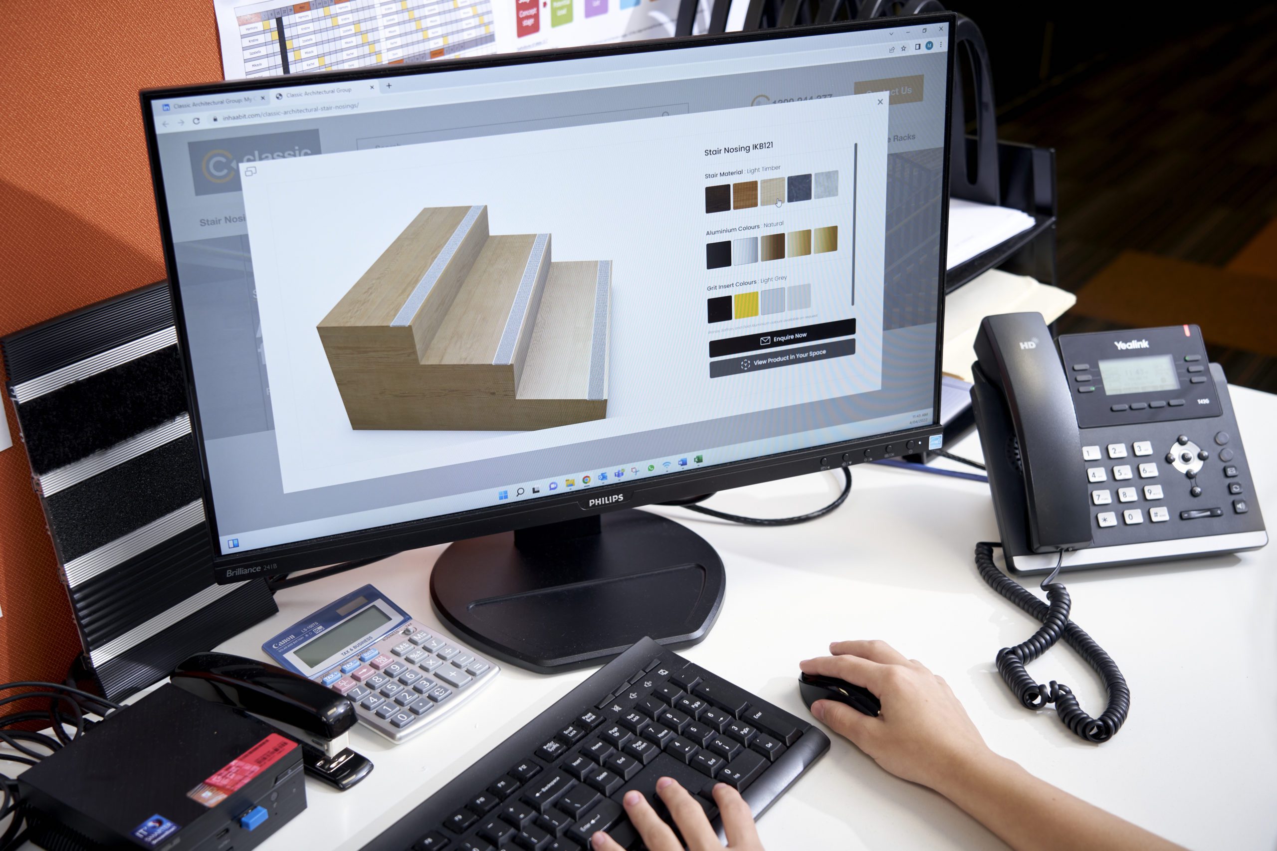
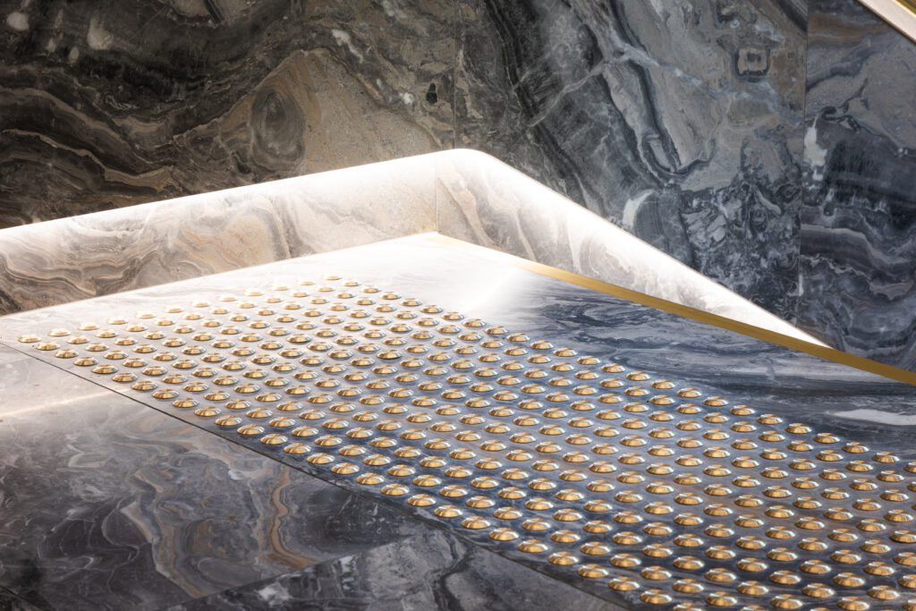
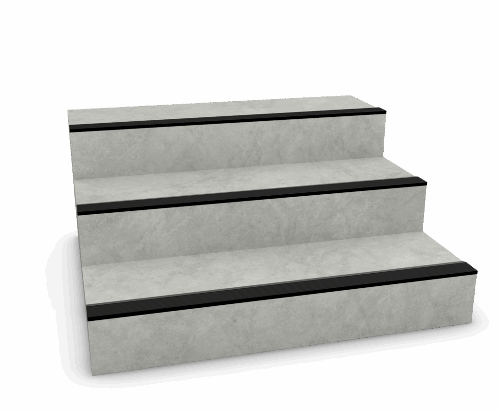
Beyond visual appeal, material choices should consider subtle yet sufficient visual contrast—for example, pairing low-profile, rebated aluminium stair nosing in platinum with light-toned tiled or marble stairs to maintain a high-end, cohesive appearance while clearly defining step edges for enhanced safety and compliance.
In addition to enhancing visual and textural interest, choosing the right design materials is crucial for ensuring long-term performance. From improved safety and durability to reduced cleaning and maintenance requirements, the smallest details can elevate your entire space with lasting value.
Commercial Design Applications of Metallic Palette
When selecting architectural safety and access features to suit a minimalist aesthetic, it’s essential to balance refined design and compliance standards.
Below are a few examples of how Classic Architectural Group can elevate your commercial project, offering sleek, functional solutions that complement a metallic palette while meeting all necessary safety and accessibility requirements.
Tactiles
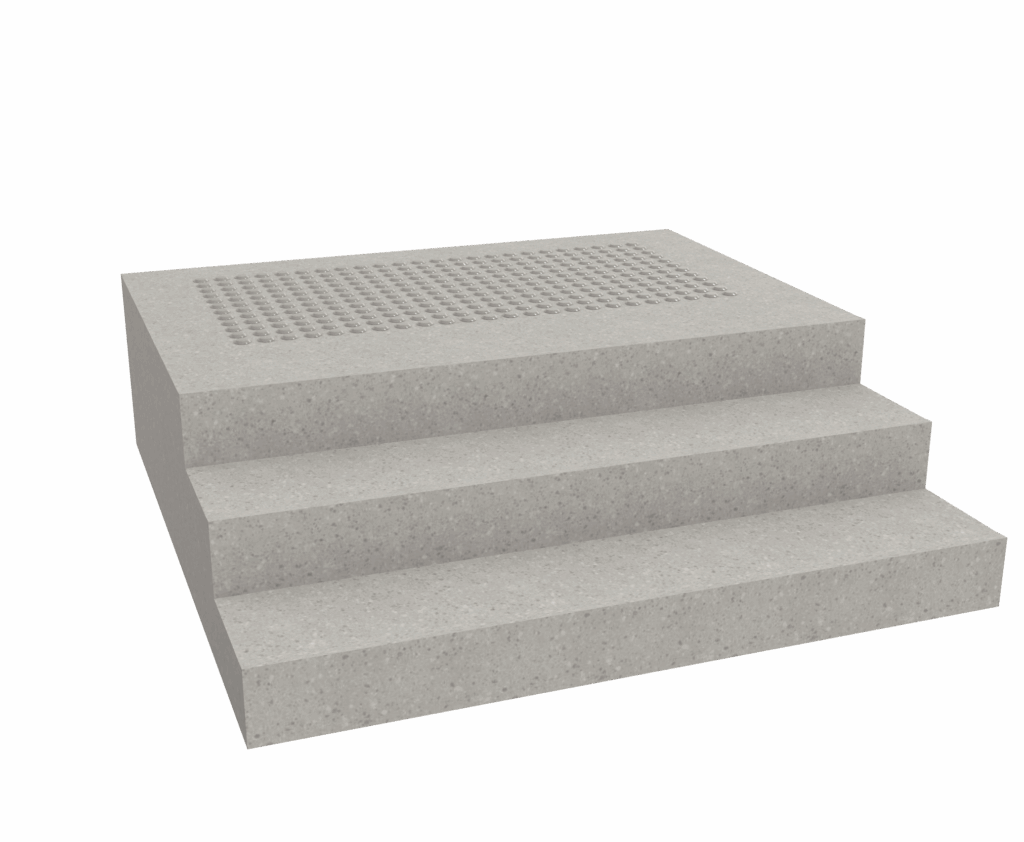
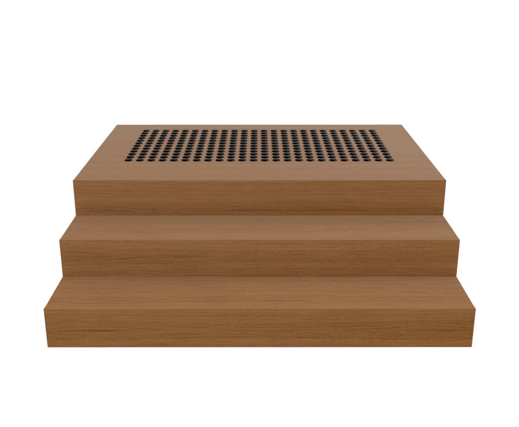
Stair Nosings

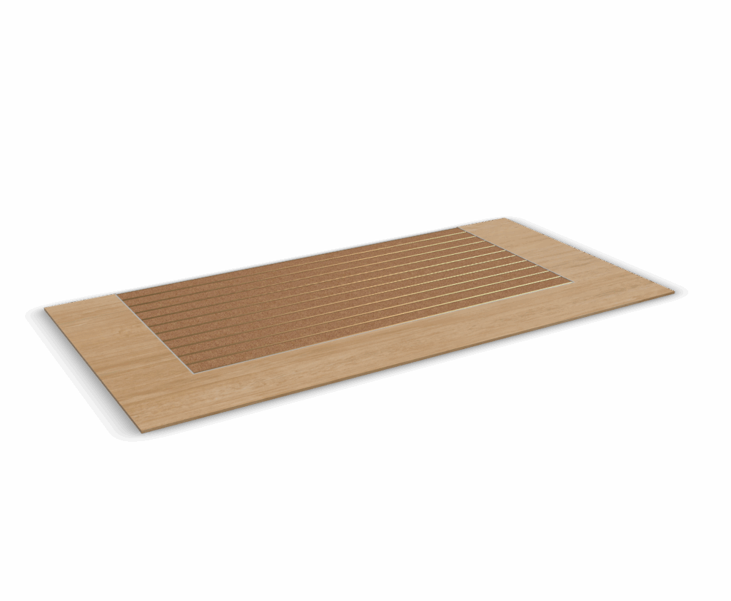
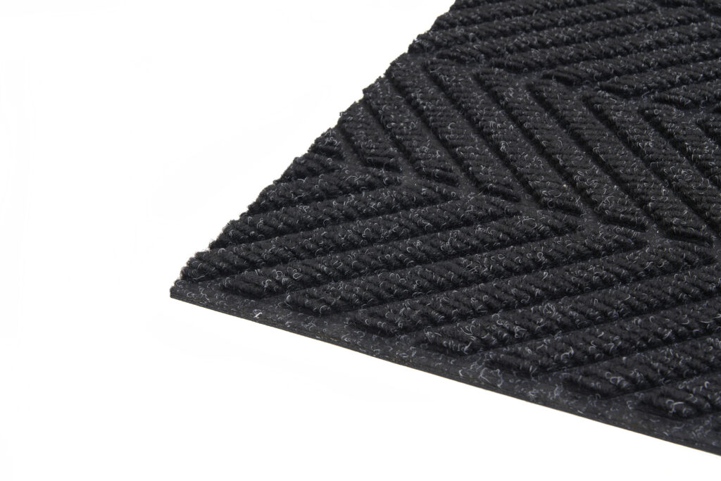
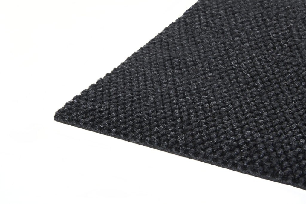
Entrance Matting
Minimalism Realised: Classic Projects in Commercial & Hospitality Spaces
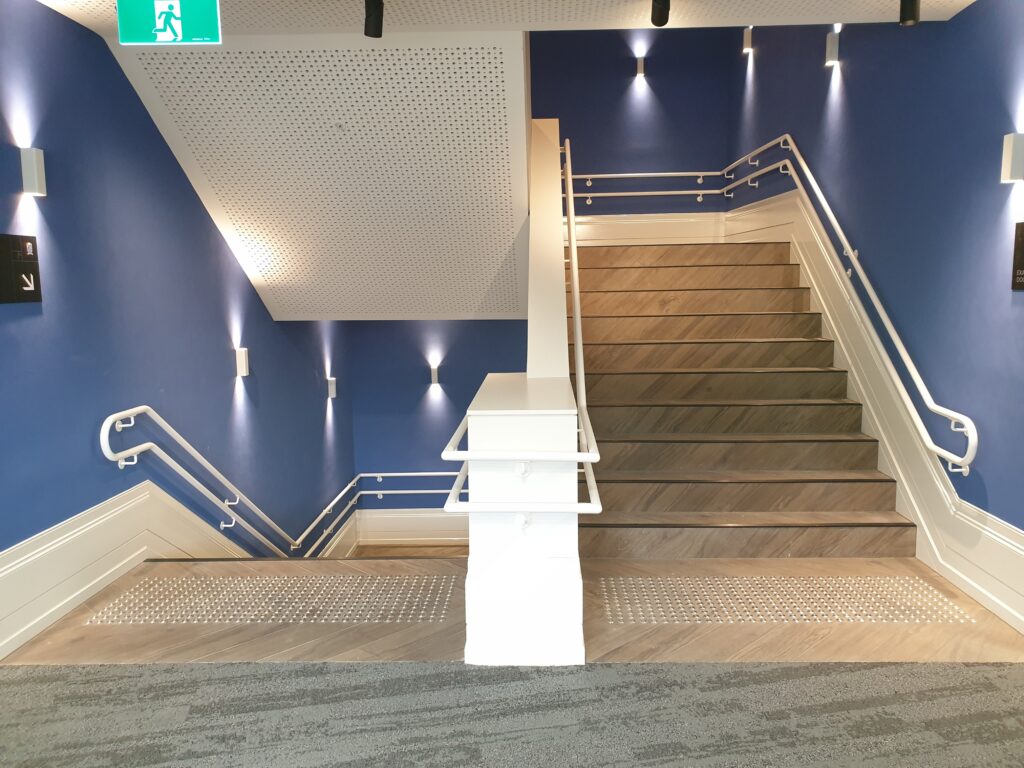
Northcote Aquatic and Recreation Centre, VIC
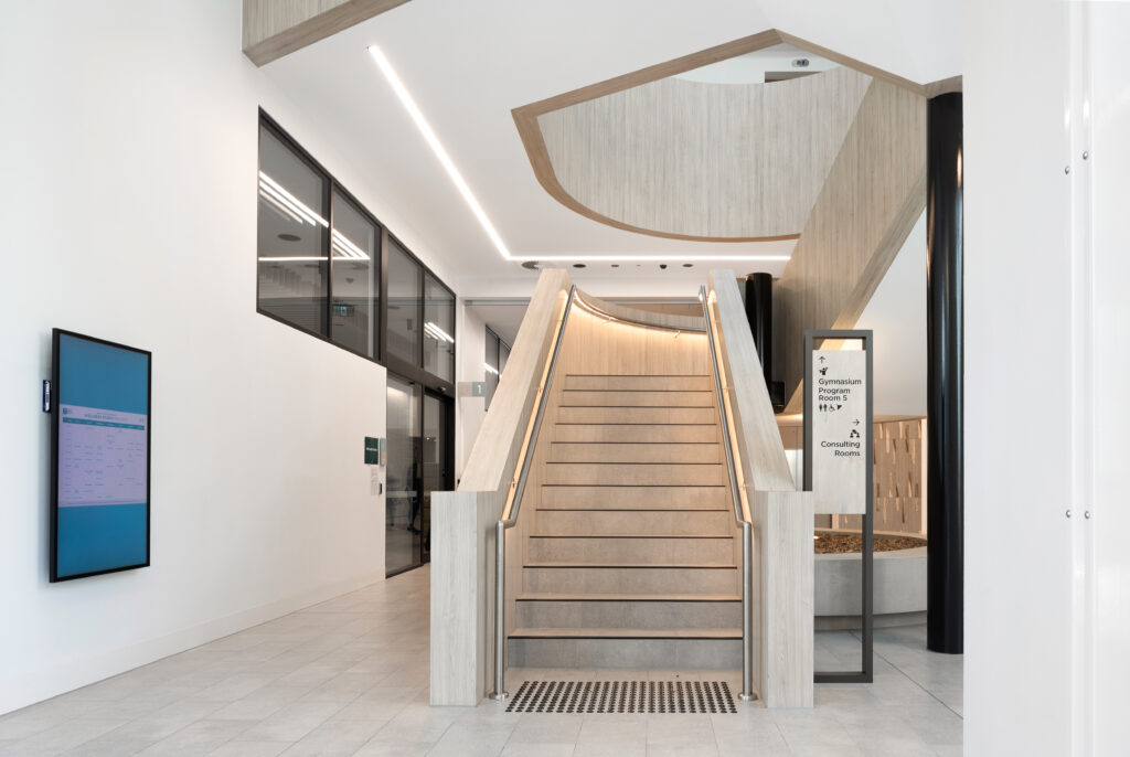
A 6-Star Green Star-rated facility, the Northcote Aquatic and Recreation Centre showcases a thoughtful selection of materials and architectural features that align with the City of Darebin’s strong commitment to sustainability and climate action.
Classic’s contribution helped ensure durability and compliance without compromising the clean, minimalist aesthetic.
555 Collins Street, VIC
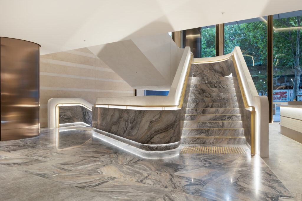
Located in the heart of Melbourne’s CBD, this $220M development blends high-end office and retail spaces across 37 storeys. With a strong focus on modern luxury, wellness, and sustainability, 555 Collins Street achieved a 6-Star Green Star rating.
Classic’s design-led safety solutions helped maintain the building’s refined, minimalist design while ensuring regulatory compliance.
Walsh Bay Arts Precinct, NSW
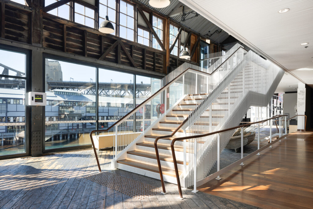
Blending heritage architecture with state-of-the-art facilities, the Walsh Bay Arts Precinct is a public arts and cultural landmark on Sydney’s iconic waterfront.
An award-winning redevelopment featuring Classic’s stair nosings and tactile indicators throughout, the project has since been lauded for its exceptional acoustics and distinctive architecture.
Where Minimalist Interior Design Meets Compliance
At Classic Architectural Group, we specialise in premium stair and floor safety solutions that seamlessly complement projects of all styles and scales across Australia. Whether you’re specifying products for a sophisticated, minimalist design or retrofitting an earthy, neutral-toned space, our stocked and bespoke solutions ensure you never have to compromise on style or compliance.
With a strong focus on both architectural design and regulatory requirements, our Metallic Accents range offers versatile colourways and finishes—from solid brass and satin stainless steel to anodised black. Need something more specific? We also provide fully customised solutions tailored to your project’s design and performance goals.
Request a complimentary product sample or contact our friendly team to discuss your next project today!