With over 1.7 million new jobs expected to be created in Melbourne alone, primarily within the CBD and inner suburbs, the City of Melbourne is on track to become Australia’s largest business precinct.
As our fast-paced cities grow denser, especially in thriving metro hubs, the need for calming yet productive nature-inspired spaces has never been greater. The shift back to in-office work is also reshaping commercial architecture, with a renewed focus on environments that promote wellbeing, connection, and collaboration.
Biophilic design is proving to be more than just a design trend. According to JLL’s 2025 research, people-centric design, employee experience, and sustainability will significantly shape commercial interiors, including workplaces, retail stores, and mixed-use developments Australia-wide.
In line with the growing demand for grounded, welcoming commercial spaces, we’re seeing a rise in the use of neutral, earthy colour palettes and natural materials—timeless design elements that help reconnect us with nature, especially within built environments.
Using Earthy and Neutral Tones to Create Grounded Commercial Spaces
Earthy Tones
While colour trends in design have shifted over the years, from bold, energising hues to pared-back minimalism, earthy tones have remained a balanced, timeless choice, versatile enough to suit both commercial and residential spaces.
Pantone’s global colour forecasts also reflect the return to warmth and nature-inspired palettes. Inspired by our collective desire for connection and comfort, “Mocha Mousse”, an earthy brown hue, was announced as 2025’s Pantone Colour of the Year.
Beyond brown, other warm tones like terracotta, ochre, and muted rust have taken the spotlight in commercial interior design. Grounding yet sophisticated, these earthy hues offer a versatile foundation and evoke a familiar sense of belonging and subtle nostalgia, making them ideal for spaces that encourage interaction, creativity, or relaxation.
Neutral Shades
Neutral tones such as soft whites, sandy beiges, warm taupes, and stone greys have long been favoured in commercial interiors. These lighter shades not only brighten and open up spaces but also create a calming effect, particularly in built areas where natural light is limited, enhancing visual flow and continuity.

Neutral tones work well alongside architectural access features like brass tactile indicators and stair nosings, adding an elegant touch without overpowering the overall design.
Exploring the Right Accents for Balance
While earthy tones and neutral shades offer a soft, muted aesthetic, strategically balancing them with accent colours is essential to prevent spaces from feeling flat or washed out. This is particularly important in commercial environments where the overall atmosphere should be conducive to well-being, creativity, and productivity.
Accents can be introduced in several ways—from statement lighting to curated artwork and branded styling elements—adding visual interest and depth. Colour accents can also be used to subtly differentiate zones within a commercial setting by influencing the mood of a space while adding visual depth.
Olive green and navy blue have emerged as popular accent colours in modern neutral interior design—not only for their ability to complement natural palettes seamlessly, but also for their colour psychology associations.
Olive green evokes harmony, balance, and connection to nature, offering a gentle contrast with off-whites, beiges, and warm taupes. Navy blue, on the other hand, is often used to communicate trust, stability, and professionalism, making it a wise colour choice in workplaces and corporate settings.
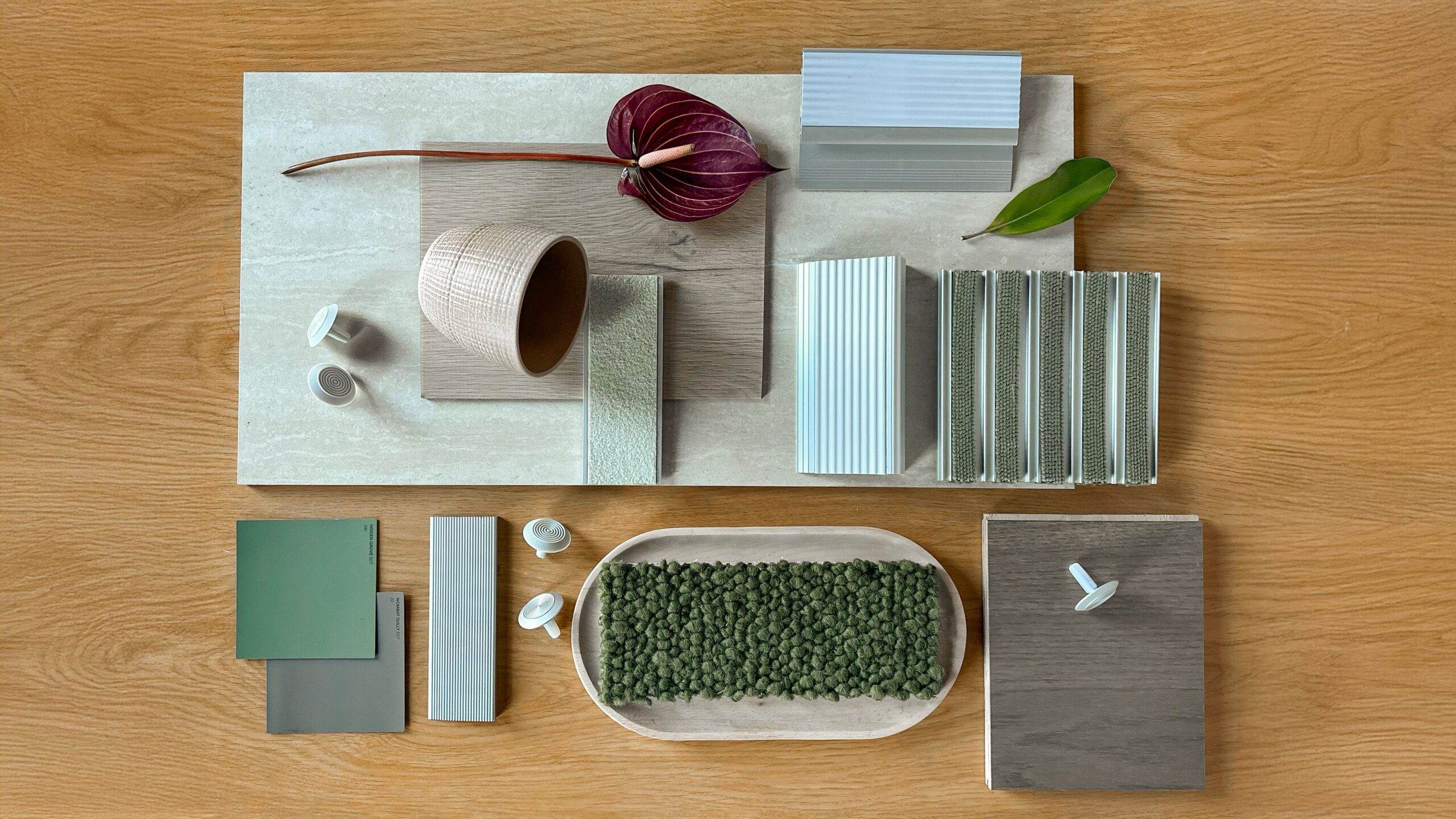
From Colour to Texture: Materials for Neutral Design
As earthy, neutral palettes set the tone for grounded, calming spaces, the choice of materials is equally vital in bringing nature-inspired interior design to life. Supporting the growing demand for biophilic, wellness-driven design, we’ve seen a strong preference for recycled materials and natural finishes in commercial architecture.
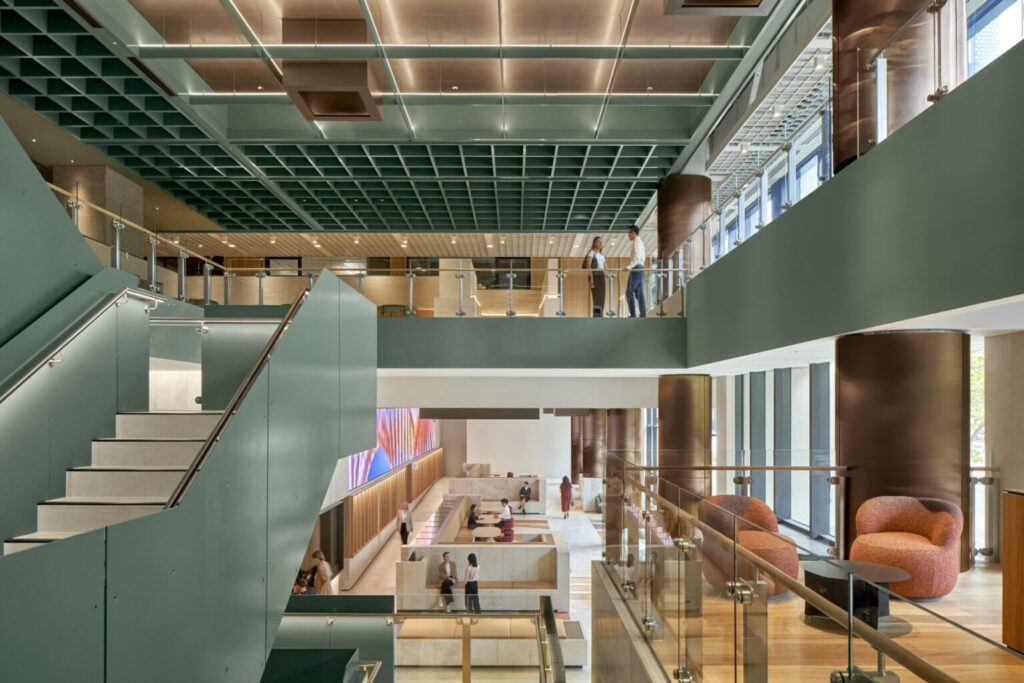
Layered with earthy tones and muted hues, sustainable materials like timber, travertine, terrazzo, marble, stone, and polished concrete add organic texture and warmth to commercial interiors. These popular flooring and surface materials not only enhance visual and tactile interest but also reinforce our connection to nature.
When paired with warm lighting and indoor greenery, the incorporation of natural materials can help create commercial environments that feel more inviting and balanced.
Commercial Design Applications of the Neutral Palette
Whether through wall colours, flooring, or window furnishings, earthy tones and natural materials allow other architectural details and focal elements to shine, supporting a more cohesive, intentional approach.
Tactiles
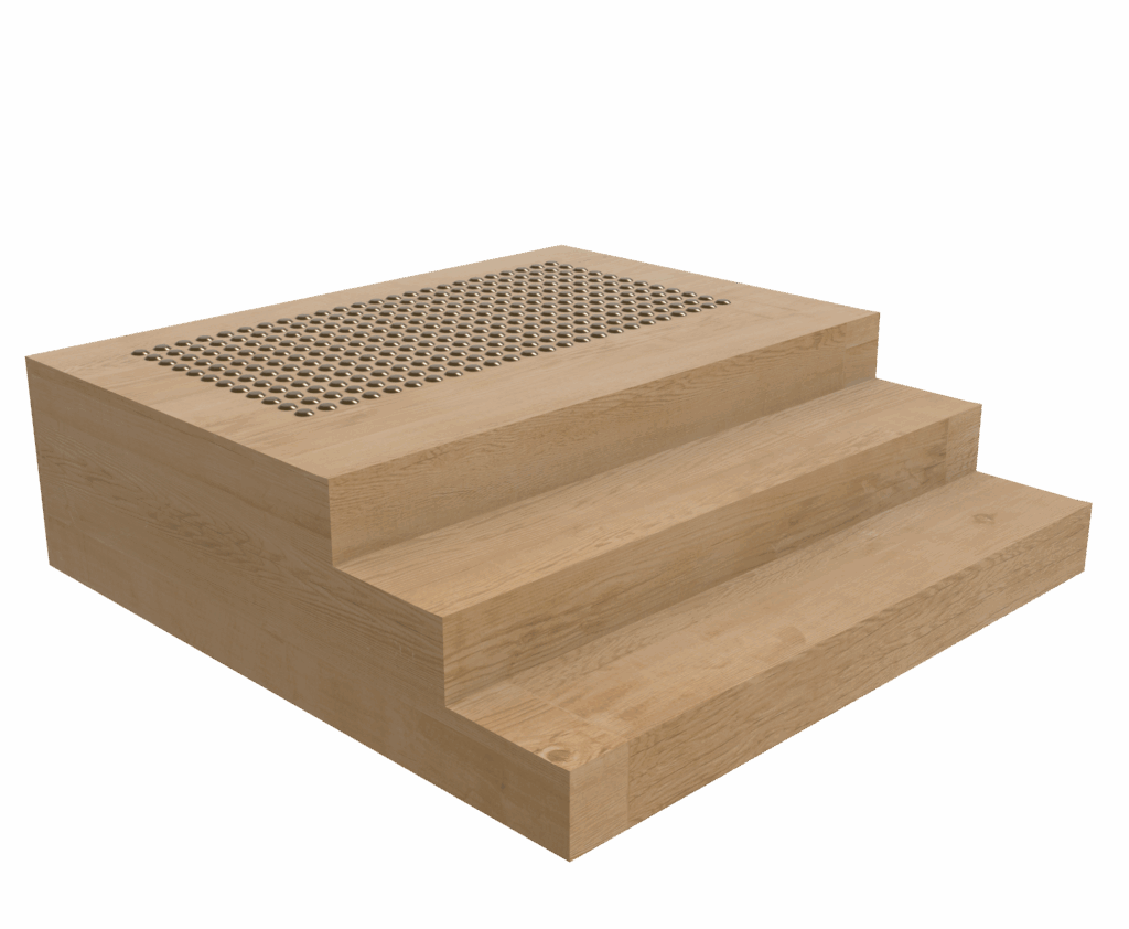

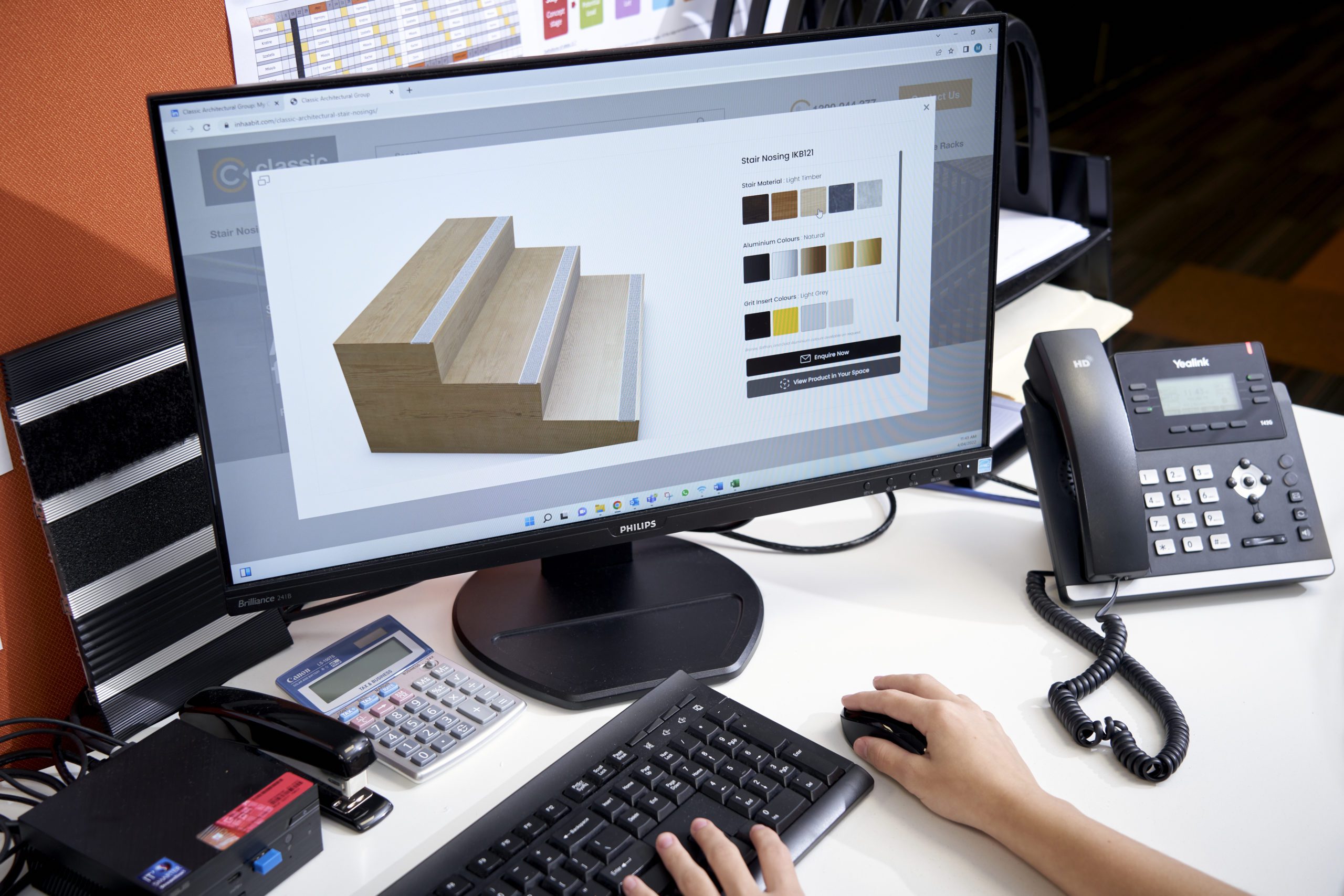
Stair Nosings
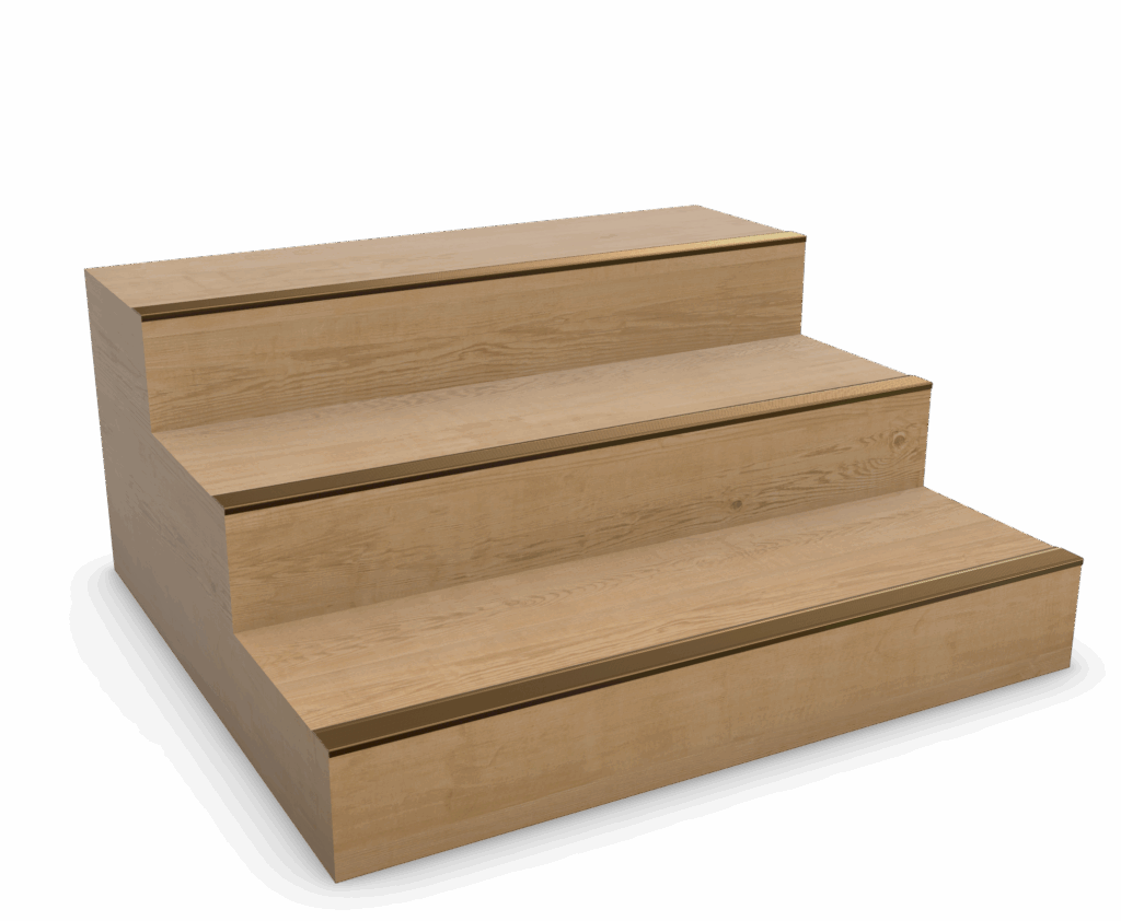
Entrance Matting
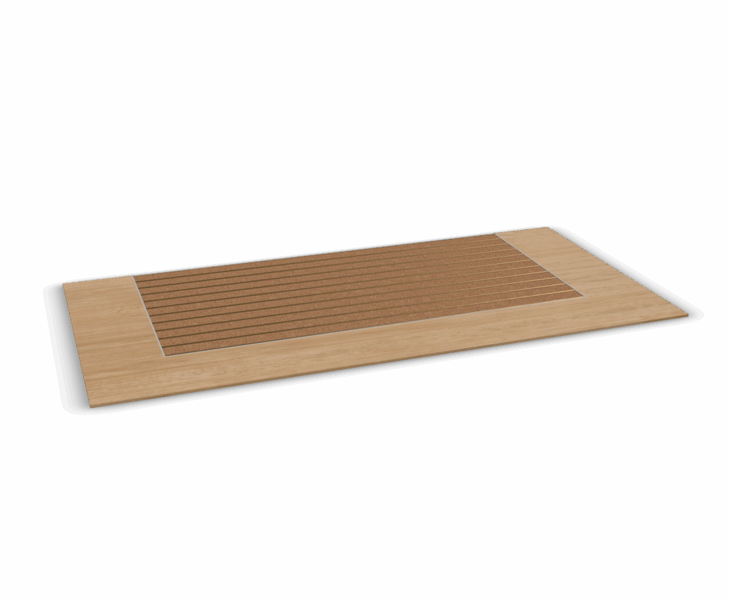
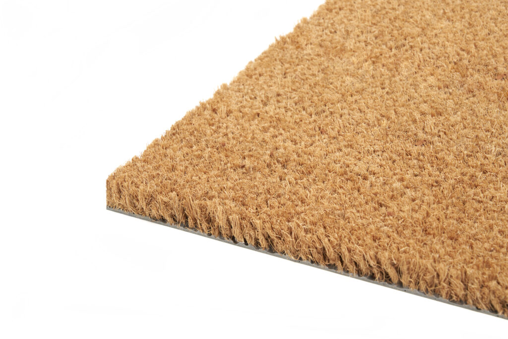
In terms of access features, Classic Architectural Group offers end-to-end stair safety and floor safety solutions for commercial applications. Prioritising architectural design, durability, and compliance, our tactile indicators, stair nosings, and entrance matting are available in stock and bespoke options—aligning with neutral palettes and modern interior design principles.
Commercial Styling Tips for Earth Tones
Exuding quiet luxury, earth tones and neutral interior design are ideal for high-traffic environments such as commercial lobbies, corporate offices, retail floors, and communal residential spaces. They foster a sense of calm, stability, and order while helping reduce visual overstimulation in busy or shared spaces.
Considering the 60-30-10 rule, a neutral or earthy tone typically forms 60% of the space as the dominant colour, while 30% is the secondary colour, and the remaining 10% is used for accents. This guideline helps balance the space, with the dominant colour providing a cohesive backdrop, the secondary colour adding contrast, and the accent colour delivering visual highlights.
Bring Your Grounded Commercial Design Vision to Life with Classic Architectural Group
As commercial spaces evolve, integrating earthy tones, neutral palettes, and natural materials offers a thoughtful and timeless approach to designing environments centred on wellbeing, connection, and functionality.
At Classic Architectural Group, we understand the importance of creating spaces that are not only visually aesthetic but also safe, inclusive, and accessible. Our expansive range of tactile indicators, stair nosings, and entrance matting is designed with both form and function in mind, ensuring your design vision is brought to life without compromising on compliance.
Explore our Neutral Tone Collection, or get in touch to request a quote or order a complimentary product sample today.