PANTONE 11-4201 Cloud Dancer has been announced as the Pantone Colour of the Year for 2026. A soft, neutral off-white that combines cool and warm undertones, it’s a timeless yet progressive shade that provides a versatile foundation for commercial interior design.
In this article, we’ll explore how Cloud Dancer can be applied across commercial and public spaces, extending into architectural finishes and safety features. With thoughtful integration, designers can create interiors that are visually balanced, functional, and fully compliant.
What Is Pantone Colour of the Year 2026 – Cloud Dancer?
The Pantone Colour Institute has shaped global colour trends since 1999, providing a universal colour language that inspires industries ranging from interior design and home decor to fashion and multimedia.
Selected as Pantone Colour of the Year 2026, Cloud Dancer is a pared-back off-white that steps away from the earthy, vibrant tones of recent years.
Symbolising new beginnings, calm, and clarity, Cloud Dancer bridges bright whites and cool greys, appearing as a very light dove grey depending on the surrounding light.
“Similar to a blank canvas, Cloud Dancer signifies our desire for a fresh start. Peeling away layers of outmoded thinking, we open the door to new approaches. An airy white hue, PANTONE 11-4201 Cloud Dancer opens up space for creativity, allowing our imagination to drift so that new insights and bold ideas can emerge and take shape.”
Laurie Pressman Vice President, Pantone Colour Institute
It harmonises effortlessly with other colours, provides subtle contrast when needed, and allows creativity to shine, making it a truly timeless and versatile choice for commercial interiors.
What does Pantone Colour of the Year 2026 represent in interior design?
Cloud Dancer, Pantone’s Colour of the Year 2026, offers a clean, sleek base that works beautifully in commercial interior design.
Whether as a standalone statement or as a supporting colour, it brings airy lightness and a sense of spaciousness, ideal for high-traffic commercial environments.
With its subtle blend of warm and cool undertones, Cloud Dancer adapts effortlessly to both natural and artificial lighting, without feeling harsh or sterile. This organic off-white hue pairs seamlessly with timber, stone, metal, and accent colours, allowing designers to create calm, balanced interiors that epitomise comfortable elegance.
Will Cloud Dancer date quickly in commercial projects?
Unlike bold, maximalist hues that can dominate and date a space, Cloud Dancer is a balanced neutral that will remain a staple in commercial interiors for years to come.
Its airy white hue lends a blank canvas, enhancing spatial perception while giving designers the freedom to introduce accent colours and layer in textures. As a structural colour base, it creates visual consistency, tying together other interior elements for a natural, cohesive finish.
With its versatile neutrality, Cloud Dancer is an enduring colour choice for long-lasting commercial projects.
Design Inspiration: How to Use Cloud Dancer Across Commercial and Public Spaces
Cloud Dancer in Office and Workplace Interiors
Light and fresh, Cloud Dancer creates calm, focused work environments while providing a neutral canvas for creativity.
Its minimal base allows bold branding or feature elements to shine, perfectly complementing contemporary workplace interior design and current office colour trends.
Cloud Dancer in Hotels and Accommodation Design
Cloud Dancer can be used in lobbies, corridors, and shared areas to create welcoming hospitality interiors that promote comfort and relaxation.
Soft yet refined, its neutrality enhances furnishings and finishes, helping designers create a memorable guest experience that reflects quiet luxury.
Cloud Dancer in Education and Public Buildings
Ideal for busy circulation areas, Cloud Dancer evokes a sense of calm and clarity, supporting wayfinding and accessibility.
Its clean, neutral tone complements signage, safety features, and other architectural elements, making it a practical, modern choice for education interiors and public building design.
Cloud Dancer in Retail and Showroom Fitouts
Cloud Dancer provides a subtle, neutral backdrop for highlighting products and displays, while ensuring visual consistency across the space and multiple store locations.
Its understated elegance makes it a versatile choice for retail interior design and showroom fitouts, making it easy to accommodate seasonal updates.
Cloud Dancer in Hospitality and Public Venues
Cloud Dancer adds a warm, inviting ambience to dining, lounge, and service areas.
Its adaptable palette creates stylish, trend-forward spaces that work seamlessly across hospitality interior design and public venues, complementing branding and customer experience goals.
Designing Compliant Commercial Interiors Without Compromising Aesthetics
When planning commercial fitouts, it’s common to focus on walls, flooring, and furnishings. However, extending your colour palette into functional architectural finishes and safety products can help you achieve spaces that are both visually harmonious and compliant.
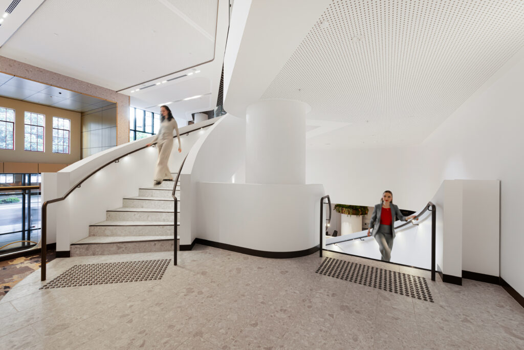
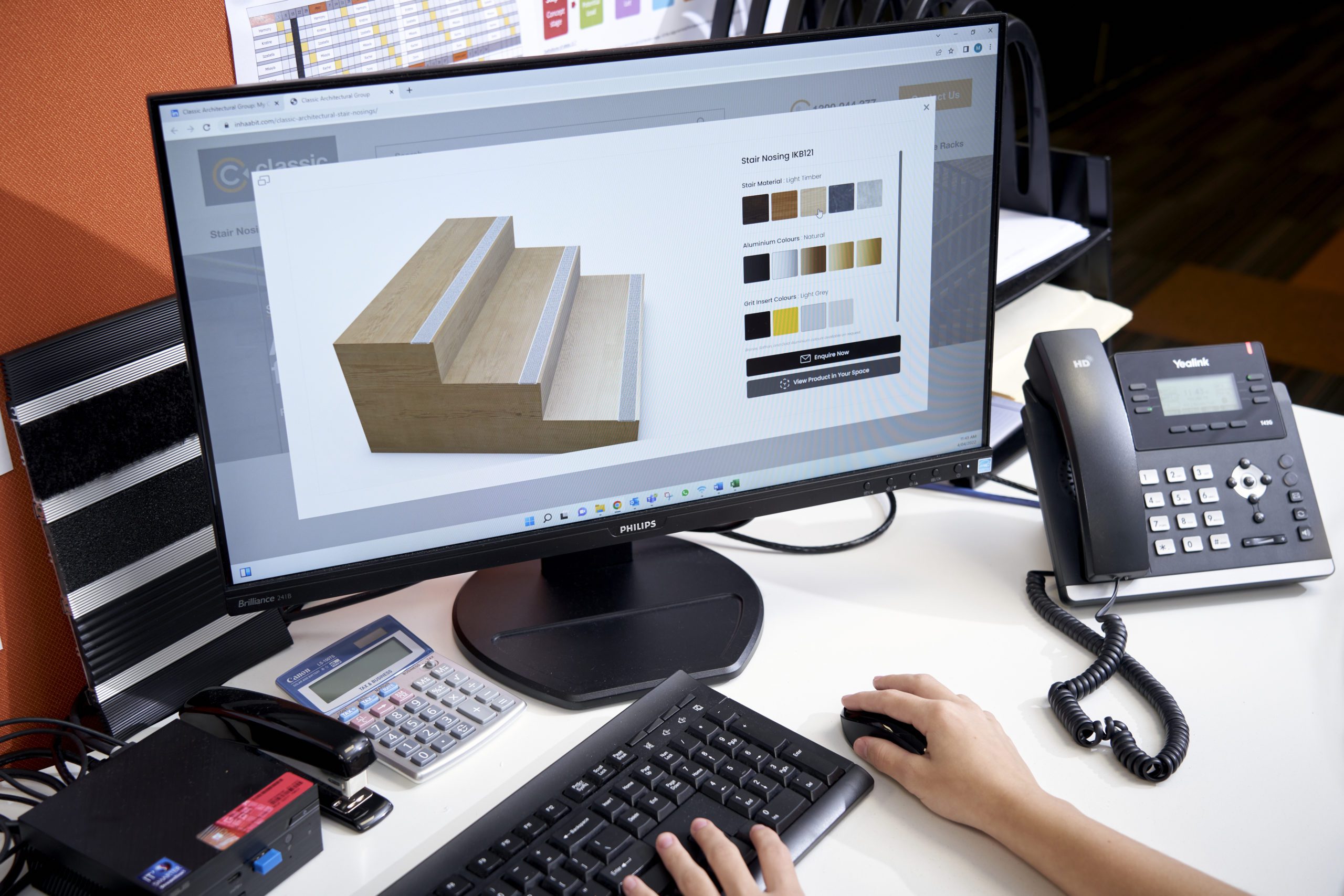
Following the 60-30-10 rule, Cloud Dancer can be used as a subtle accent to complement surrounding finishes. For example, using it as the 10% accent colour for tactile indicators or stair nosing inserts to improve step visibility, grip, and spatial clarity while adding a refined, modern touch.
Classic Architectural Group supports building professionals by offering architecturally designed safety and access solutions that balance compliance, durability, and aesthetic appeal.
From tactiles and stair nosings to entrance matting and car park fitouts, all products are designed to meet Australian Standards, ensuring compliant commercial interiors that are safe, accessible, and visually cohesive.
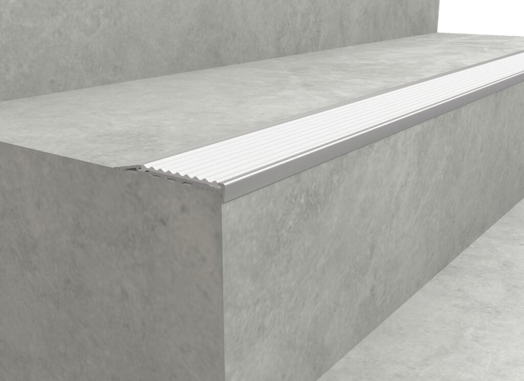
Stair Nosing Inserts Colour-Matched to Cloud Dancer
Colour-matched nosing inserts provide subtle contrast to improve step visibility without adding visual clutter or overpowering the design.
In Cloud Dancer, they add refined detailing that pairs beautifully with light timber, stone, or tile surfaces.
Integrating nosing inserts with your colour palette delivers a stair safety solution that feels intentional and visually considered, while prioritising safety, accessibility, and compliance.
For commercial stair nosings, we can colour-match your inserts to Cloud Dancer or any Pantone shade.
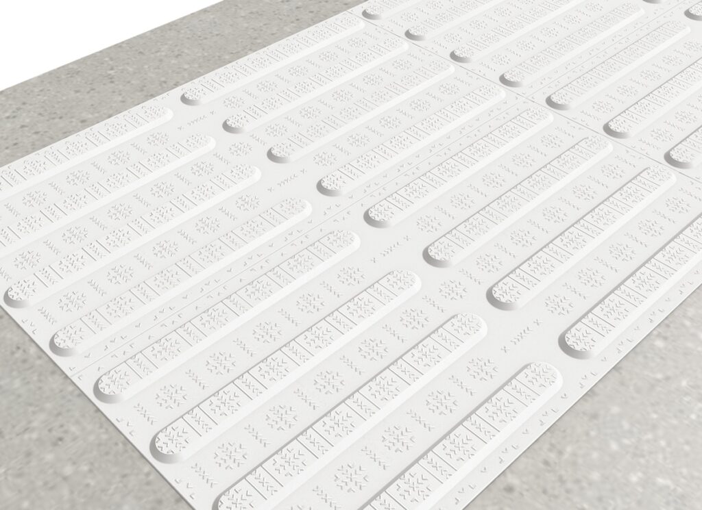
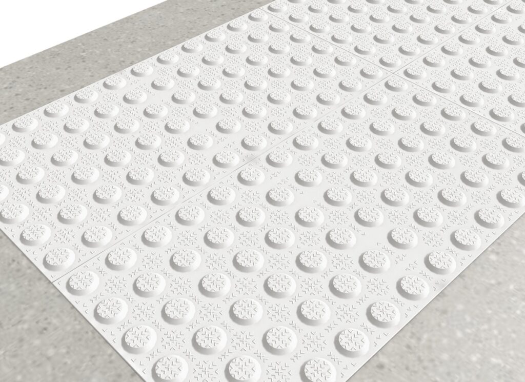
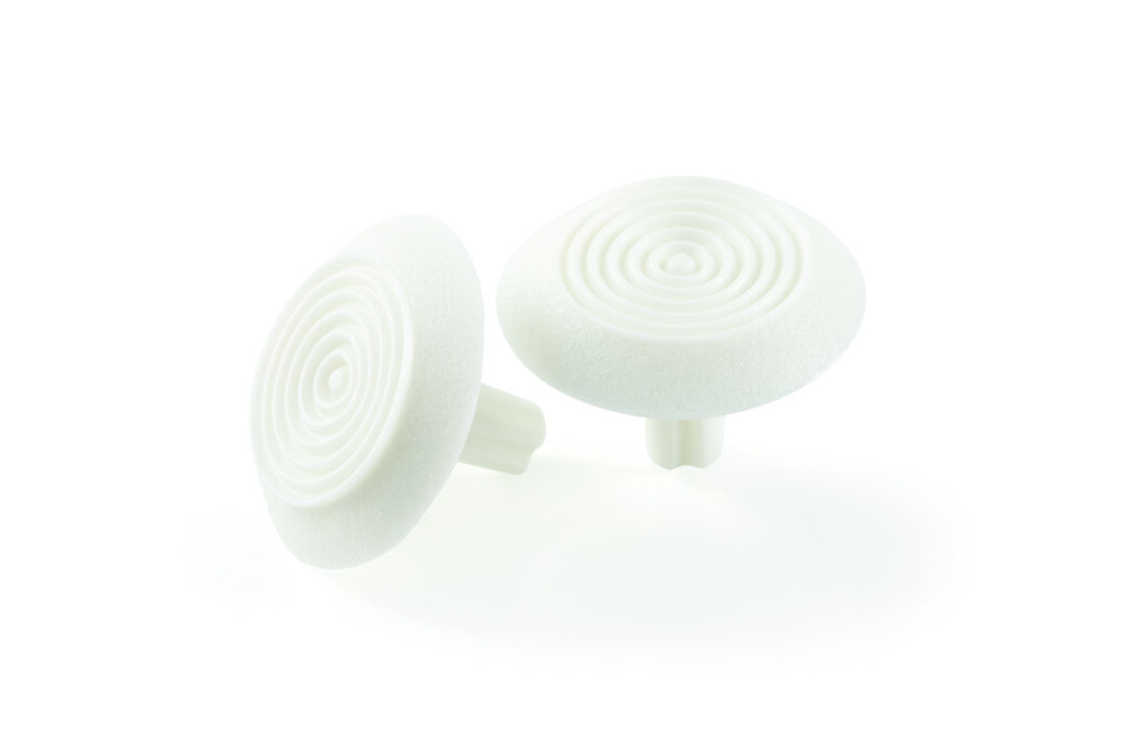
Tactile Indicators That Align with Interior Colour Palettes
Tactile indicators are an essential accessibility feature, helping people with vision impairments navigate shared spaces safely and confidently.
When colour-matched to your interior colour palette, such as Cloud Dancer or other complementary tones, they provide clear directional guidance and warnings without disrupting the overall design.
Suitable for both interior and external areas, tactile indicators can either blend with or contrast surrounding surfaces, supporting both your architectural and functional goals.
Polyurethane Tactiles for Compliant, Design-Led Interiors
Extremely resilient and colour-durable, polyurethane tactiles are designed to withstand daily wear while maintaining a consistent appearance, making them ideal for high-traffic commercial spaces.
With custom colour matching, these tactiles can be integrated seamlessly into your design scheme for visual consistency.
Combining functionality with aesthetic flexibility, polyurethane tactiles help create compliant commercial interiors that meet accessibility standards without compromising on style.
Creating Cohesive, Timeless Commercial Interiors with Cloud Dancer
More than a fleeting trend, Cloud Dancer stands out as a considered choice for commercial interior design in 2026 and beyond.
Its balanced off-white base, with both cool and warm undertones, provides a versatile foundation for other materials, textures, and brand elements to take focus. Whether used as a transitional tone or a subtle feature, it adapts effortlessly to evolving design needs and seasonal updates.
At Classic Architectural Group, we can support your design goals through precise colour matching across stair nosing inserts, tactile indicators, and polyurethane tactiles, available in any Pantone shade.
Combined with our technical expertise and custom design capabilities, we deliver safety and access solutions that meet compliance requirements without compromising visual quality.