A celebration of brighter, hopeful times ahead and the unyielding human spirit
From eager New Year resolutions to uncovering new trends, the start of a new year makes way for fresh beginnings. Considering the unsettled times of the previous year, the saying “out with the old, in with the new” will resonate now more than ever, as we journey into 2021.
Annually anticipated for over 20 years, Pantone’s Color of the Year has long influenced and inspired design, packaging, product development and purchasing decisions. Setting the colour tones for multiple industries, from fashion to home furnishings and industrial design, the selection process is led by a considered analysis of the latest trends.
Combing every corner of the globe, Pantone’s Color Institute team takes inspiration from diversified influences including the entertainment industry, upcoming films, art, travel, lifestyle, socio-economic conditions, technologies and more.
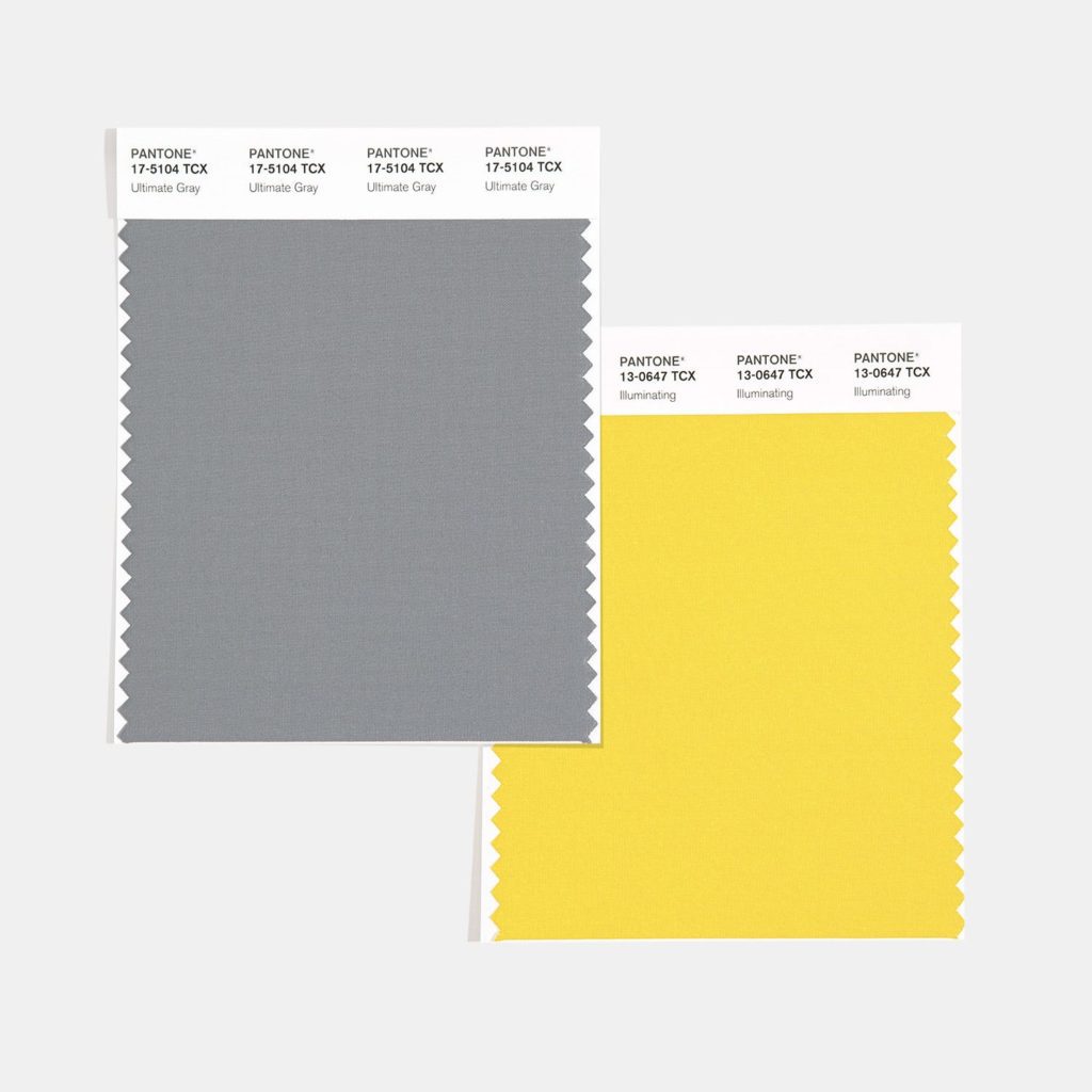
Pantone’s 2021 colours: PANTONE 17-5104 Ultimate Gray + PANTONE 13-0647 Illuminating
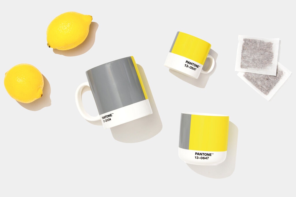
Perhaps an apt response to the worldwide COVID-19 pandemic that struck in 2020, this year’s Pantone colour selections are two independent yet supportive hues – PANTONE 17-5104 Ultimate Gray and PANTONE 13-0647 Illuminating. Dependable and practical, PANTONE 17-5104 Ultimate Gray provides a firm, everlasting foundation, while the bright, cheery PANTONE 13-0647 Illuminating emanates strength and positivity.
“The union of an enduring Ultimate Gray with the vibrant yellow Illuminating expresses a message of positivity supported by fortitude. Practical and rock solid but at the same time warming and optimistic, this is a color combination that gives us resilience and hope. We need to feel encourage and uplifted; this is essential to the human spirit.”
– Leatrice Eiseman, Executive Director of the Pantone Colour Institute
Together, they pay tribute to the fighting human spirit in times of continuing uncertainty, while aspiring to a brighter, hopeful future.
Explore our Classic take on this year’s colour trends
As your trusted go-to for all things architecturally-designed safety and access solutions, Classic Architectural Group works hard to stay on the forefront of the latest industrial and design trends.
Rather than playing it safe, we consistently look to Pantone Color Institute and other trend-setting leaders in the field when researching and updating our innovating product range. With options for both classic and contemporary applications, our solutions are customised to seamlessly complement your project requirements.
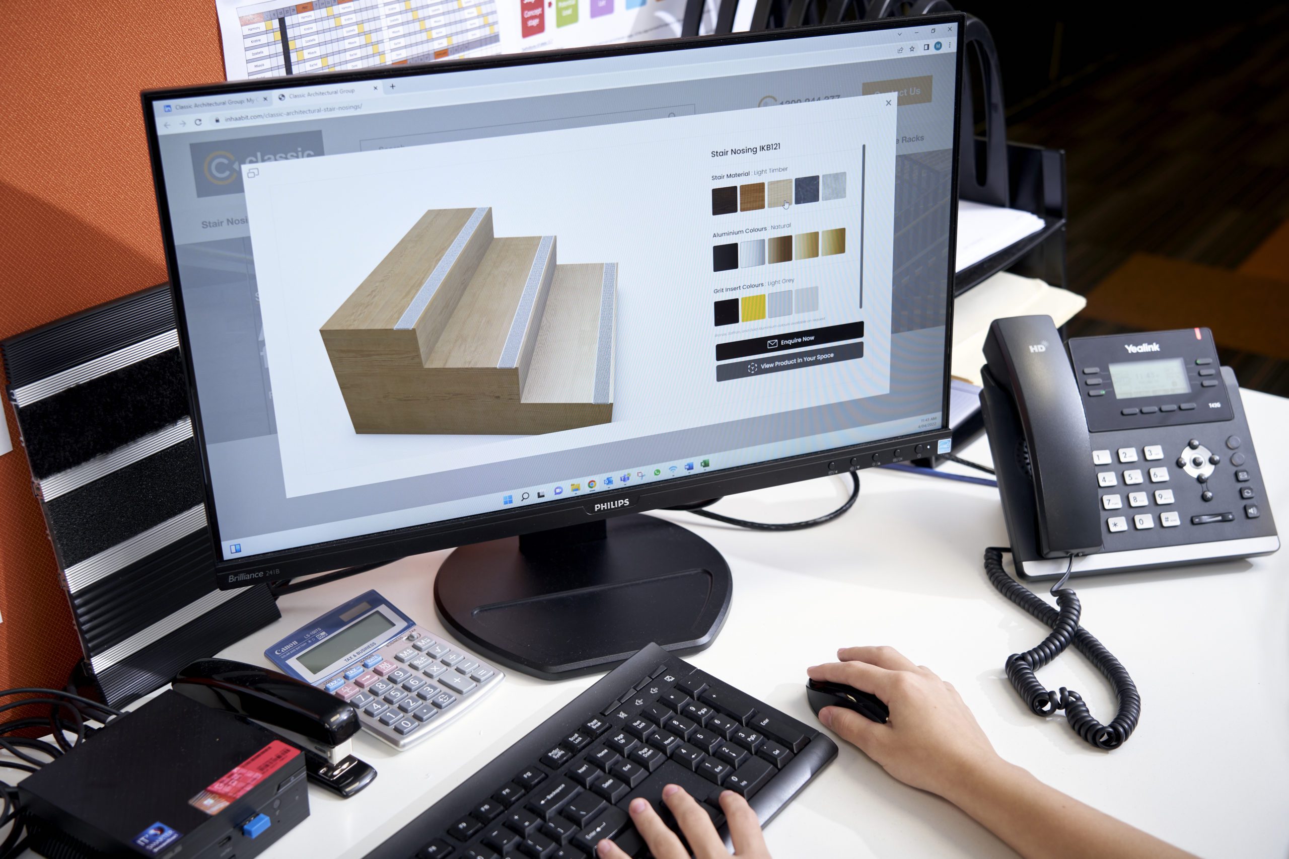
Beautifully aligned with Pantone’s 2021 colour selections, we are excited to offer Mid Grey and Yellow inserts which are available in many of our Classic Tredfx stair nosing options.
Our 2021 Pantone-friendly stair nosing products
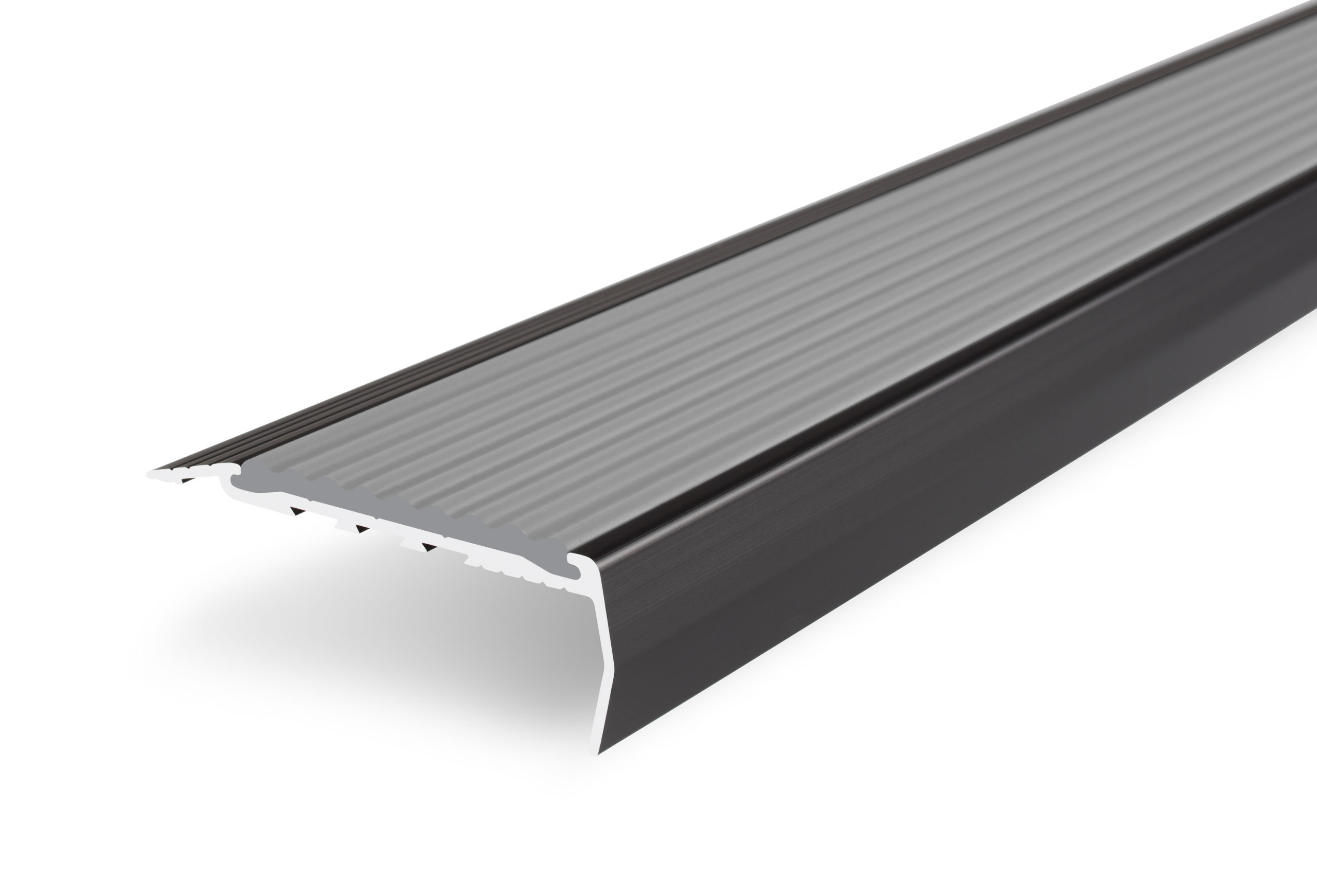
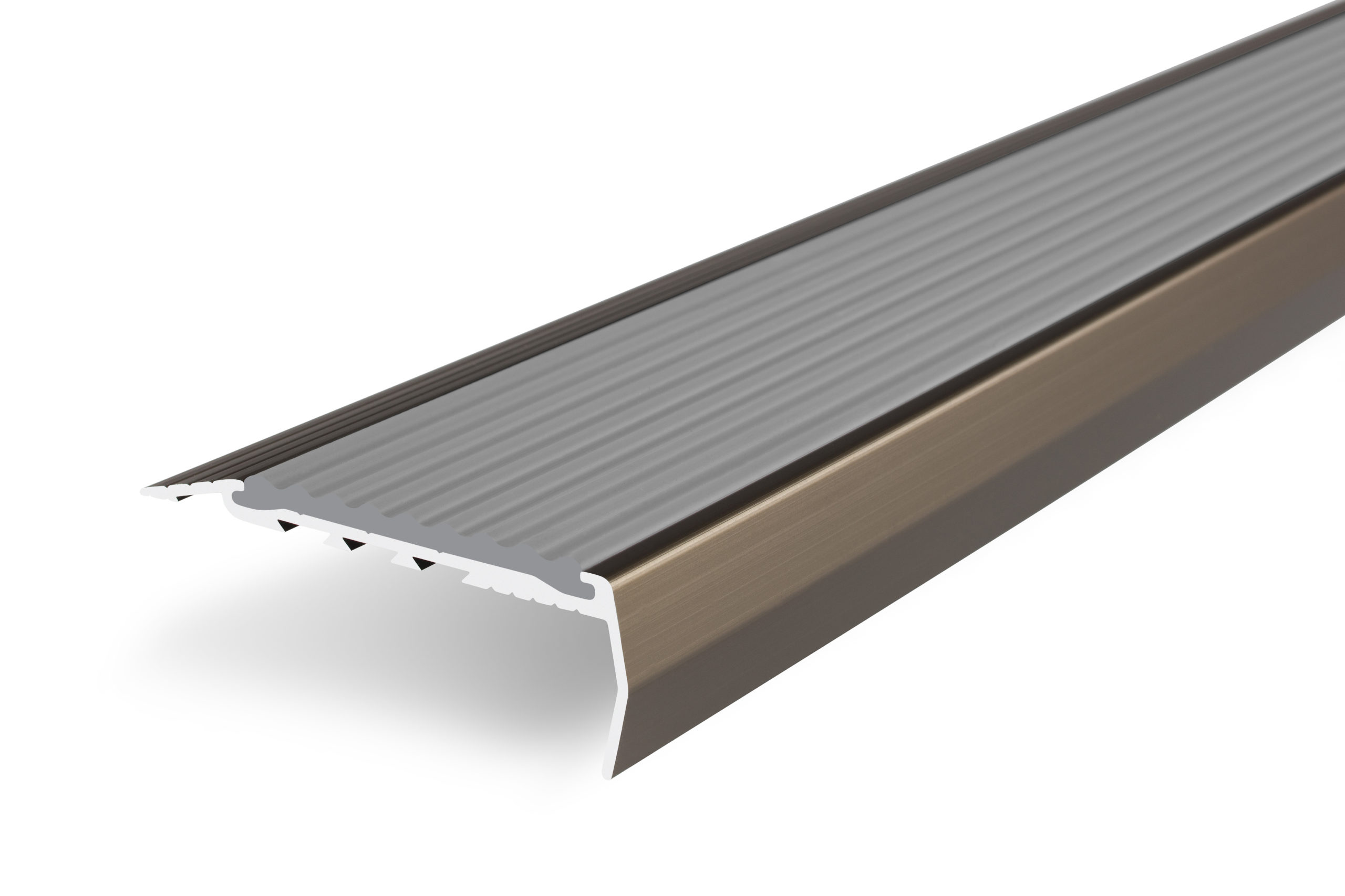
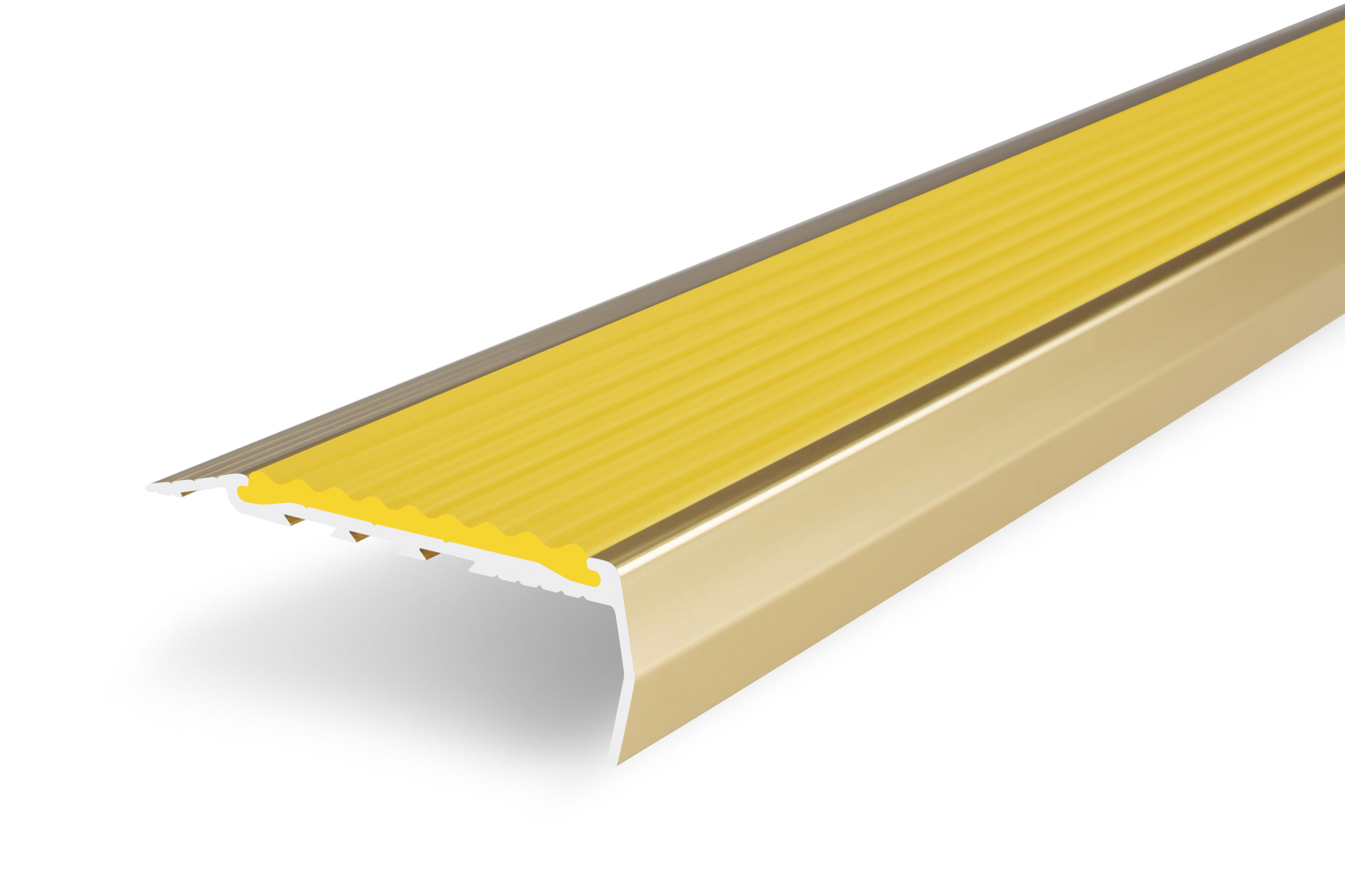
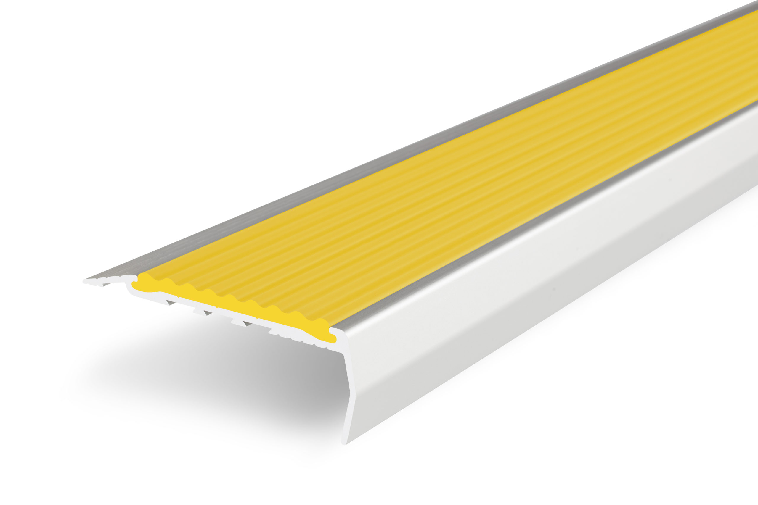
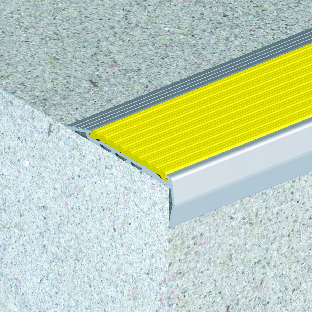
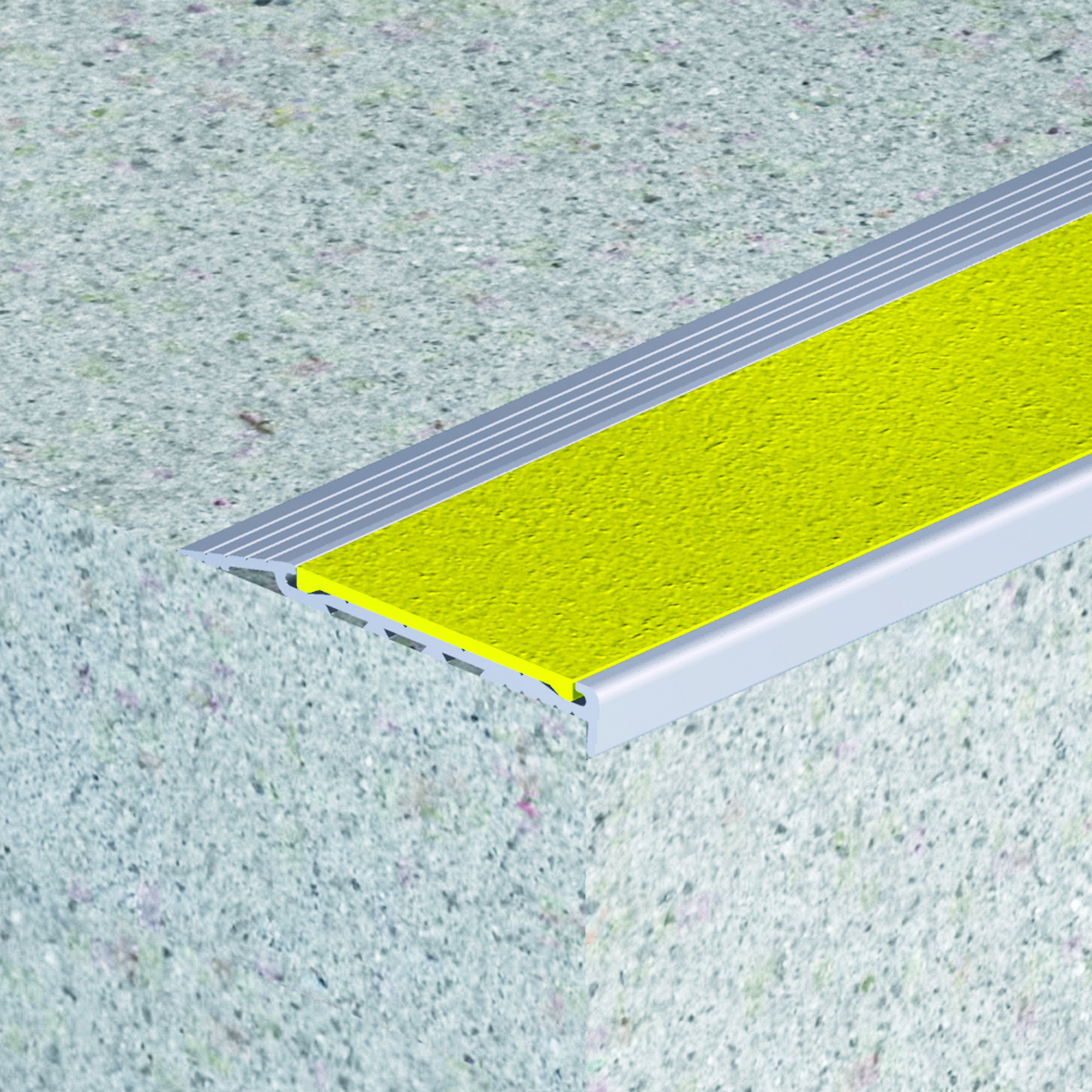
Covering inserts for SBR103, SBR104, SBV105, DKR103 and DKR104 stair nosings, they’re also available in a myriad of aluminium colours including Natural, Black, Gold and Bronze.
Our friendly team are more than happy to consult and recommend the best products to align with your architectural vision.
Also available with our brand new Classic Tredfx Solid Brass stair nosing range
Plus, you’ll be glad to hear that our recently unveiled Classic Tredfx Solid Brass stair nosing range also comes with the on-trend Mid Grey and Yellow insert colourways.
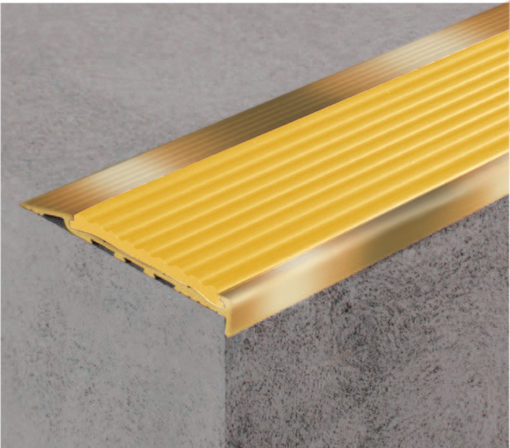
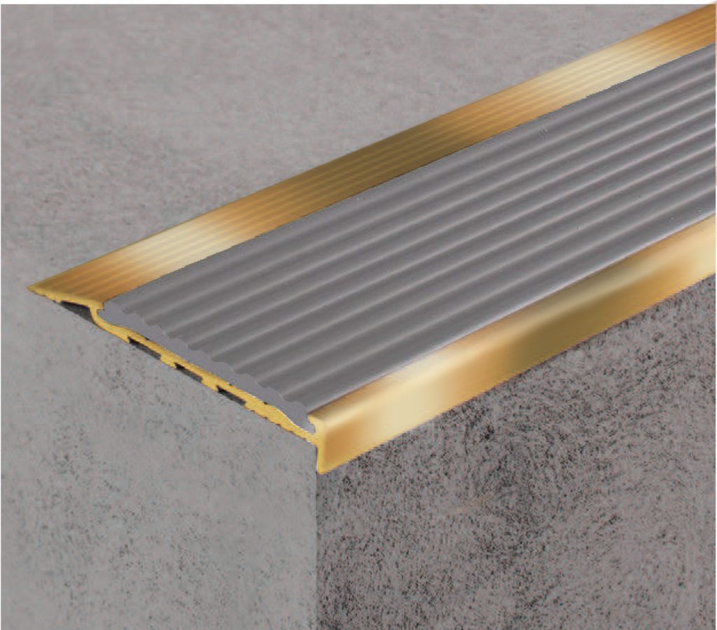
Missing Pantone’s pop of colour from previous years? Classic Tredfx stair nosing continues to offer the bold, fun colours from 2020, 2019 and 2018.
We’re here and ready to support your upcoming project requirements
It may be a new year but Classic’s promise remains the same. From initial consult to design and installation, you can always rely on us for exceptional service and innovative products that are versatile in design, colour and application.
Whether it’s stair nosings, entrance mats, tactile indicators or other, our team offers over 39 years’ experience in public access solutions that can complement any design or layout.
To learn more about how we can help your next project step ahead, get in touch with us today!
